Emanuel Vigeland Museum: Redesigning a Neglected Digital Space
The Emanuel Vigeland Museum's website had not been meaningfully updated since 2001, leaving a fragmented, inaccessible digital experience that failed to reflect the museum's striking physical presence.
Details
- Role
- UX Designer
- Type
- Semester Project
- Year
- 2026
- Tools
- Figma
How I worked
Groundwork
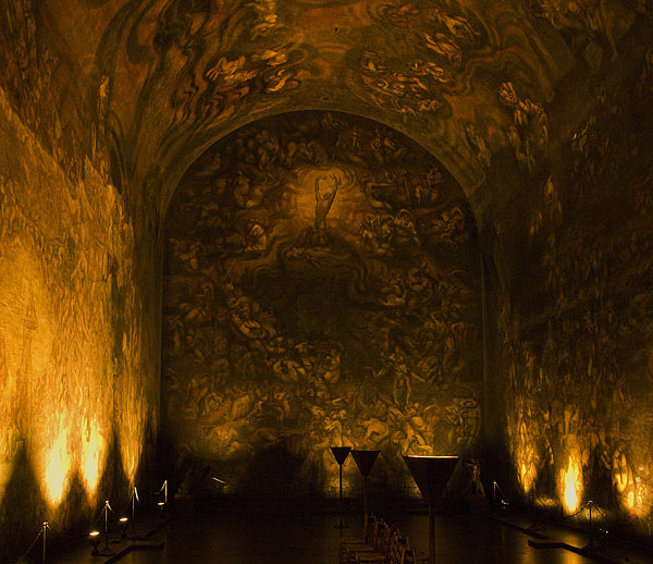
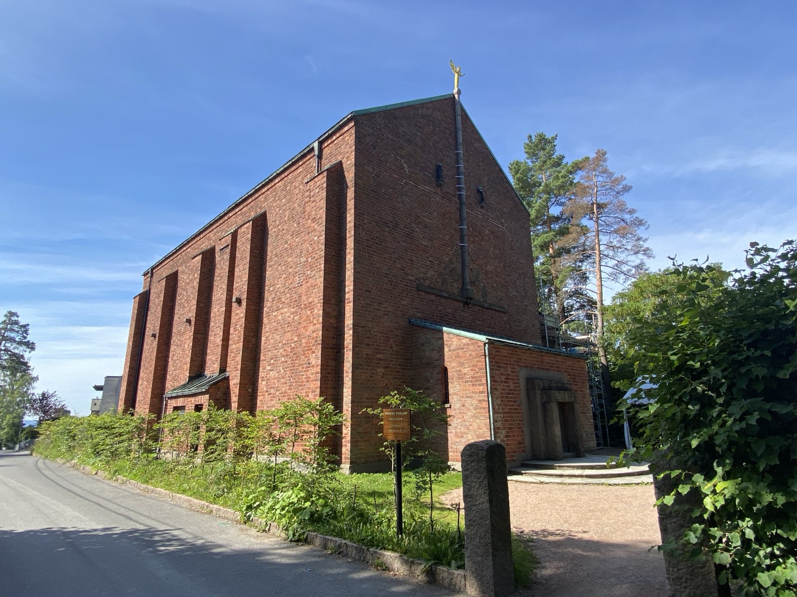
Emanuel Vigeland Museum is a unique mausoleum and concert venue in Oslo, known for its dark, atmospheric interior and the monumental fresco Vita. Despite the strength of the physical experience, the website had barely changed since 2001: poor mobile support, fragmented concert information, no clear calls to action, and limited accessibility. For many users, the website would be their first encounter with the museum.
A site visit gave direct exposure to the museum's atmosphere and context. Interviews with the daily manager surfaced operational needs and limitations. A UX evaluation of the existing site, a user survey, competitor analysis, and four personas helped define the core problems: scattered navigation, hidden concert information, unclear ticket flows, and accessibility gaps. MoSCoW prioritisation shaped the scope.

Design
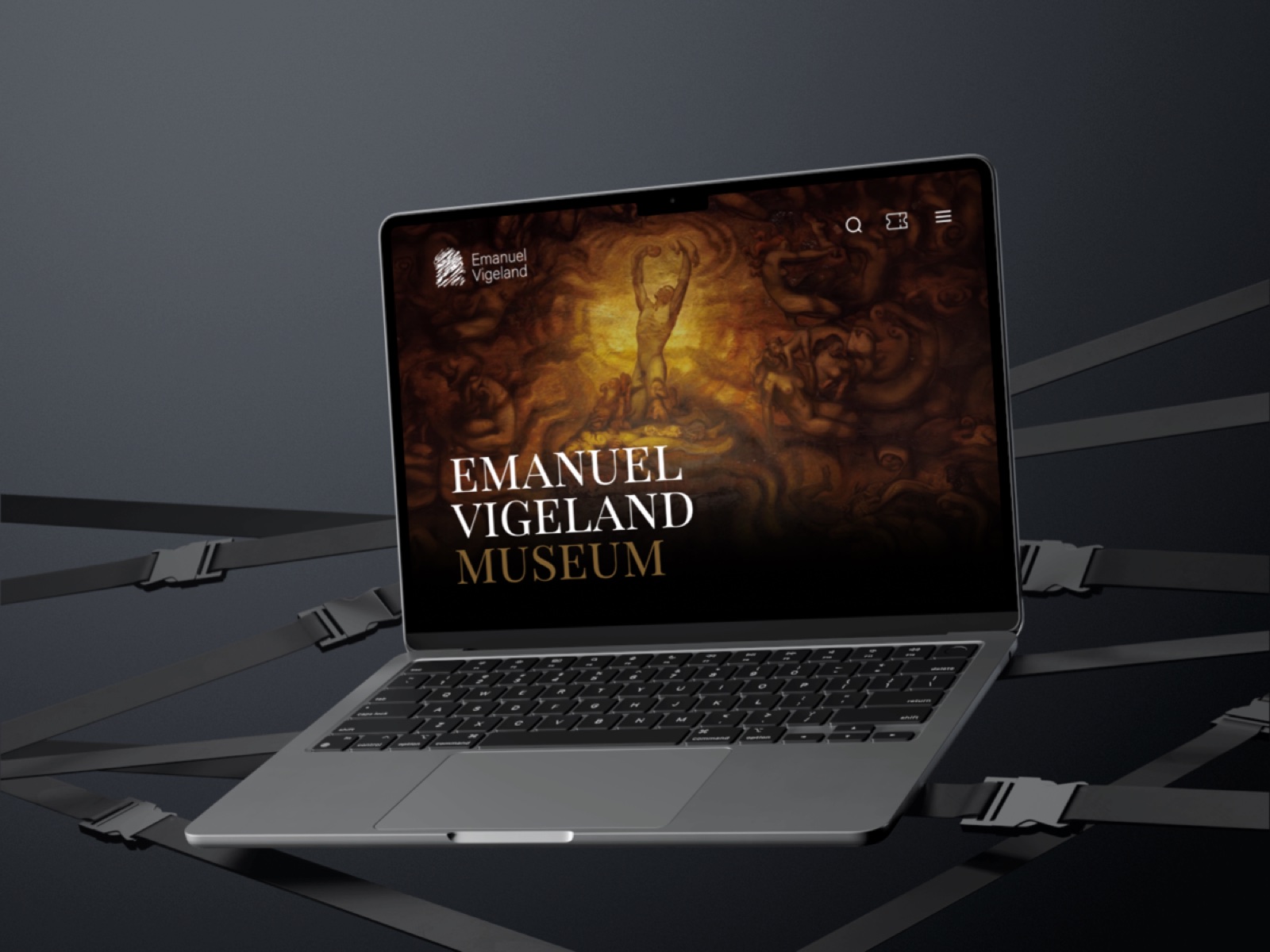
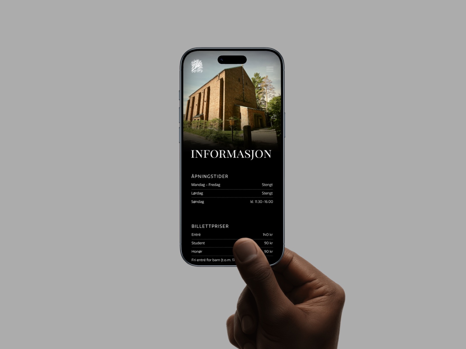
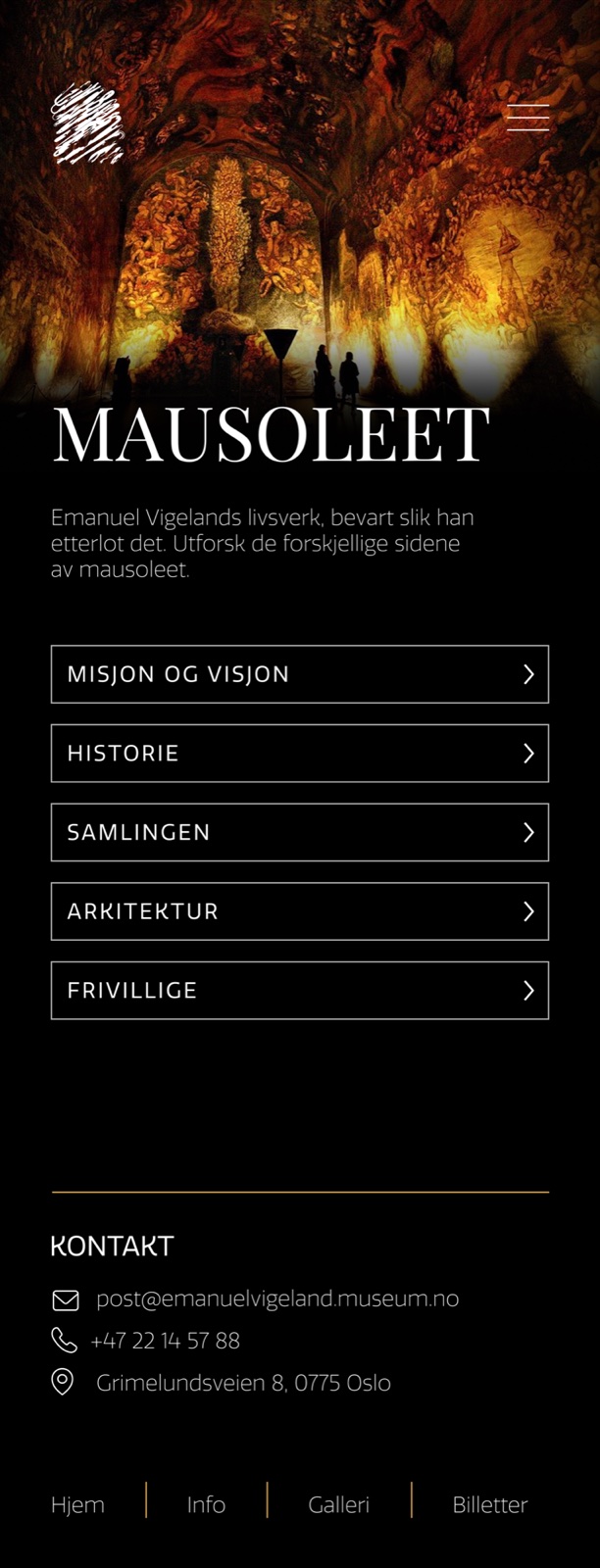
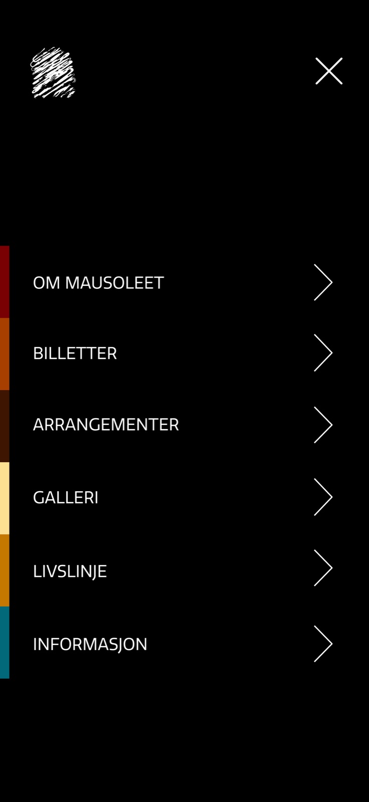
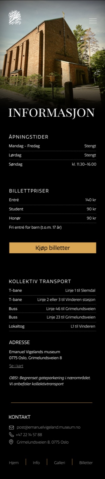
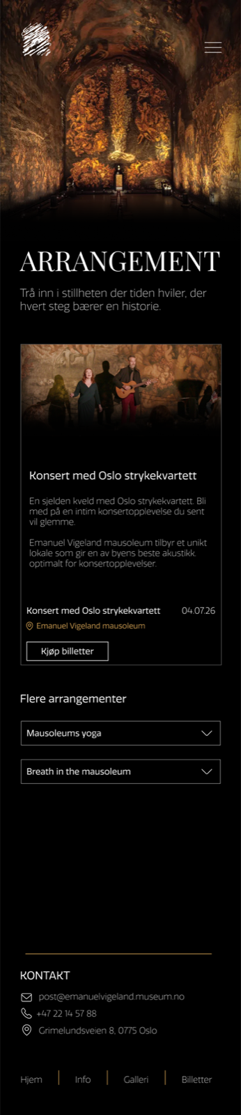
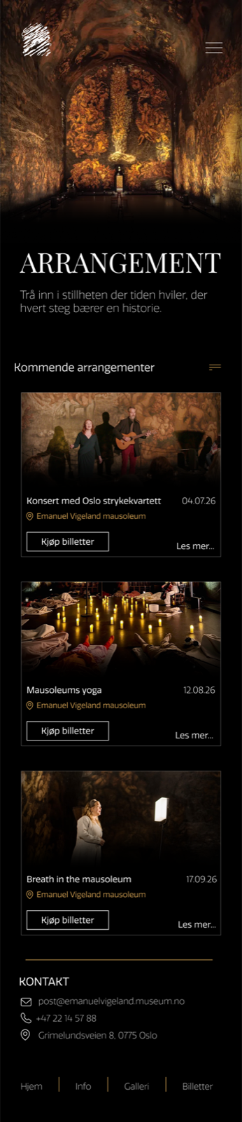
The solution was structured around three main areas: museum visit, events, and collection. The design took a mobile-first approach, reflecting how most users would plan a visit or find concert information. A dark, sensory visual identity was developed to carry the atmosphere of the physical space into the digital one: deep tones, restrained typography, and considered use of space.
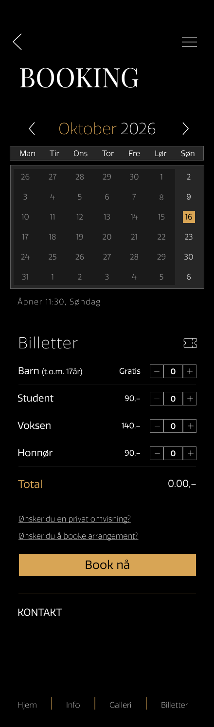
The booking flow, the most complex interaction, was broken into five clearly separated steps: calendar, ticket selection, summary, payment, and QR receipt. Each step reduces cognitive load and provides a clear progress indicator. Micro-interactions were kept quiet and brief. All interactive elements meet WCAG minimum touch target sizes.

Outcome
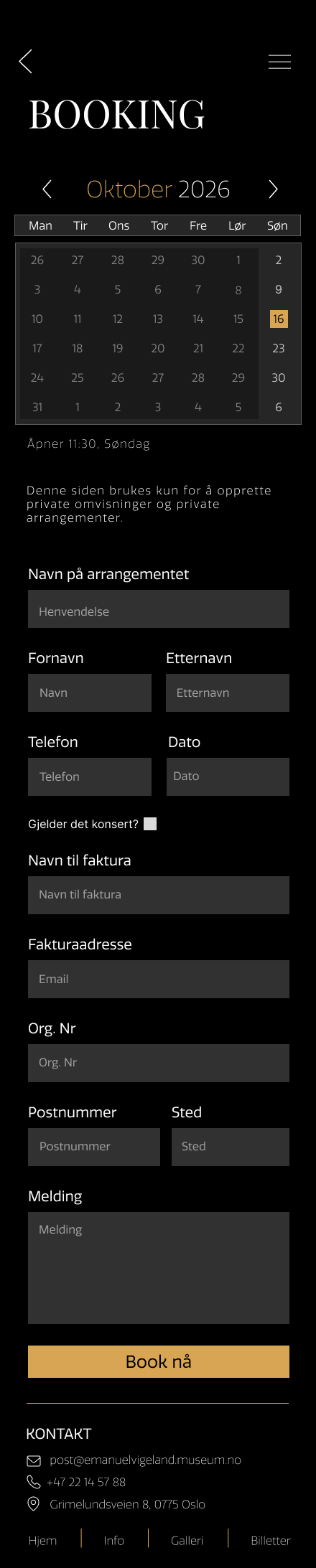
The final Figma prototype covers all primary user journeys: planning a visit, discovering events, buying tickets, exploring the collection, and booking the venue. A design system defines colours, typography, components, and interaction states. The project demonstrates how rigorous information architecture and a clear visual identity can make a culturally rich institution more accessible, without losing what makes it distinctive.